Tuesday 13 September 2011

Project - Drawing Trees

These are some of the sketches I did using pencil and charcoal.  Studies of individual trees and groups of trees.


Drawing a statue

This was my attempt at drawing a statue.
It stands in the middle of the market place in Bury St Edmunds, but it was a busy day, and I felt very self concious trying to draw it, so I ended up taking a photo.

Project - Townscapes

The next exercise involved a study of a townscape using line.
I enjoyed doing this drawing.  Working in pen is good for me as I know I can't rub it out, and Tipp-ex isn't really the done thing!
Then we had to do some sketchbook drawings of building in a town. Trying to get a sense of the buildings and structure.

Then I moved on to doing a limited palette study from the sketches.  I don't know why I chose purple, mustard and rust.  I think the pencils looked good together in the tin.  On the paper, not so good, but you get the idea.

Project- Perspective

This was a really frustrating part of the course.  Not only did I have lines going everywhere across my drawings, but none of them seemed to meet at the right place.
The first exercise was parallel perspective- drawing a doorway straight on. Then we had to do a drawing using angular perspective.  I chose the side of a house. 
I then stuck the drawing to a larger bit of paper to try extending the lines and seeing if they all met on the eye level line. This proved to be a major headache as I just got really confused about which line should go where.
Not a very good photo but you get the idea.
I was glad to move on to the next project.

Another go at plotting space through composition and structure

This is another try at dividing the foreground, middle ground and background in a drawing.  I used watercolour pencils for this one as it was easier to get a better contrast between light and dark.

Thursday 30 June 2011

Exercise: Drawing cloud formations

This is as difficult as drawing animals.  You just get set up and draw a few squiggles for the outline, and then look up again only to find the whole thing has moved.  I need to try again on a very still day!
The next exercise was plotting space through composition and structure.  I think in my drawing I have achieved a foreground, middle ground and  background, but I did have difficulty in varying the tone sufficiently to convey the feeling of distance in the landscape.

Thursday 23 June 2011

Exercise: 360 Degree Studies

This exercise was designed to show how the landscape changes just by shifting your viewpoint slightly.  Here is my attempt at four 15 minute sketches.


Wednesday 22 June 2011

Research Point - Different artists' depictions of landscape

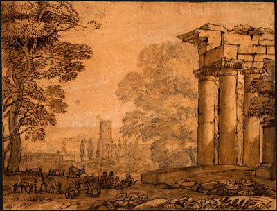
I have started by looking at Claude Lorrain (1604-1682).  He was a landscape artist at a time when landscape was not seen to be a subject in its own right, and also there was no market for paintings whose subjects were merely landscapes.
Some of his landscape paintings have small scale details in them, such as figures.  These seem only to serve as giving the painting a sense of scale and don't seem as important as the grand landscapes that surround them.
.
Pastoral Landscape (3) - Claude Lorrain (Gellee) - www.claudelorrain.org  Pastoral landscape


Another artist I looked at is Albrecht Durer (1471-1528).
These are two of his very different depictions of landscapes.
Castle Court (Innsbruck) - Albrecht Durer - www.albrecht-durer.org  Castle Court (Innsbruck)


Pond in the Woods - Albrecht Durer - www.albrecht-durer.org Pond In The Woods

These are two impressionist paintings by Camille Pissarro.
File:Pissarro lordship.jpg  
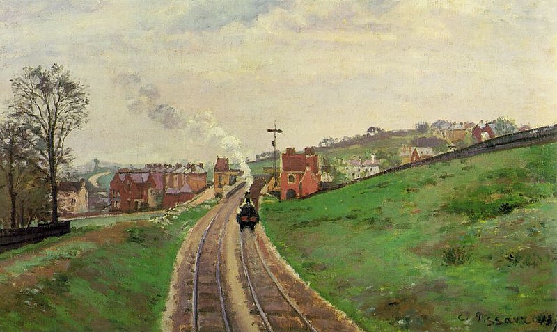
Lordship Lane Station   Jallais Hill at Pontoise (1867)


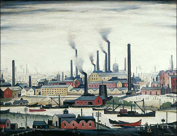
This is an industrial landscape by LS Lowry.  A riverbank (1947) 


And, this is something completely different.  A painting by Australian artist Fred Williams (1927-1982)
Landscape with Goose - Fred Williams Paintings Landscape with Goose 1974

Saturday 16 April 2011

Project- Landscape drawing

This is the third part to the course and focuses on landscape drawing.  The first exercise was a sketchbook walk.  This entailed rapid sketching, using a viewfinder to help focus on a point of interest and drawing without rubbing anything out. 
Something is wrong with the perspective of this first drawing but I think we will study that in due course, so I didn't spend ages trying to rectify it.
I am pleased with this second drawing.  Having the buildings directly in front of me, helped with the perspective problems.

Sunday 27 March 2011

Assignment 2 - Still life

I am now putting together my work for this second part of the course, and drawing my final picture for assignment 2.  I set up a still life using contrasting objects of various sizes and textures, bark, stones and a willow branch.  I decided to work in pastels as it is good for coverage and also to get the depth of colour needed. I chose an off white/ buff coloured paper to work on as the buds were quite light and needed a slightly darker contrast.
 

Research Point - George Stubbs

Born in Liverpool, George Stubbs (1724-1806), had little formal training in art but developed a flair for portraiture and an interest in studying anatomy.  He rented a farmhouse in Lincolnshire and spent eighteen months dissecting horses before publishing his book Anatomy of the Horse in 1766.


  His life like paintings depicting horses and also sporting and racing scenes were considered more accurate than that of any previous painters. This was due to the many in-depth studies of musculature and movement he made before beginning to work.

 One of his most famous paintings is Whistlejacket, which now hangs in the National Gallery in London.

Wednesday 9 March 2011

Another fish

A friend gave us some herring, following a fishing trip they had taken, and I couldn't resist trying to draw one.  Not a brilliant success, as I was trying to use layers of hatching to build up the tone, and the pencils being quite soft just ended up blending into one another.  I was trying to stop myself blending everything together, but on this occasion it didn't quite work.  Oh well on with the next drawing....

Thursday 24 February 2011

Fish on a plate

My  attempt at drawing a fish on a plate.  I  was quite pleased with the watercolour pencils, even though I did manage to draw a bright blue line right across my bass!  It was the first time I had used these pencils and I found the exercise really enjoyable.

Drawing animals


The idea behind this exercise was to grab the chance to draw some animals.  Having a garden full of chickens and other feathered creatures I had the ideal subjects.  Sadly, none of them would stand still, so I tried the rabbits and then eventually tried drawing some ponies. Here are my efforts. 


Friday 11 February 2011

Negative space in a plant

This is my attempt at drawing the negative spaces surrounding a pot plant.  Admittedly the pansy did not have that much foliage, which made the drawing a little easier.  It was quite hard to keep concentrating and draw the spaces surrounding the plant, rather than the plant itself.

This next exercise was called, plants and flowers in coloured pencil.  I have just realised that I did my drawing in pastels instead.  So much for reading the instructions! 

This last drawing was an experiment using a dip pen and coloured ink.  The pansies were obviously not this dark, but I got a bit carried away with the black ink.

Friday 4 February 2011

Using marker pens


This is my attempt at drawing a composition of fruit using marker pens.  They have a thin and thick nib to them and I found the thicker line easier to shade with.  As with the coloured pencils I may have used a little too many colours and overworked the drawing a bit, but this is all new to me.

The next drawing was an exercise in using oil pastels .  This is not one of my greatest successes, but it  was fun to do.  It did take a long time to try and build up the colours, and I found the white pastel really useful to blend the colours together.  I do like to blend...

Wednesday 2 February 2011

Project- Drawing fruit and vegetables in colour

Exercise- Using hatching to create tone
For this drawing we had to start  by drawing individual pieces of fruit, paying attention to the shapes or planes that make up the outline. I used coloured pencil and drew a larger than life apple and pear.

We then had to make up a composition with two or three pieces, and using hatching show the different shapes and tonal values.
I was quite pleased with this drawing but I may have overworked the colours a bit. 

Friday 28 January 2011

Still life group using line and tone


This exercise involved drawing objects using  line, with only minimal tone. I chose the logs in the log basket because they had some interesting textures and shapes.  I used A3 paper and a black roller tip pen.  I drew quickly and tried to fill the page, but it proved very difficult to give the drawing any depth as it was supposed to be about line and not tone. I must admit to putting in a little shading, just to try and make the drawing look right.

My next attempt at drawing was a little more successful.  This exercise was to draw a still life group in tone.  I arranged some sea shells on a plate and drew them in pastels on A3 paper.  As I was working in pastels I didn't manage to get in all the intricate detail of the objects but, the idea was to explore tone using only three colours.  I chose a dark brown for the deepest tones, rusty orange for the mid tones and a pale cream for the lightest tones.  I wasn't sure if I was allowed to blend the colours, but couldn't really help it as I was working in pastels.

Wednesday 19 January 2011

Exercise- Getting tone and depth in detail

For this exercise I had to build up dark, medium and light tones.  The shells didn't come out too bad.  I did use black pen for some of them which didn't allow the same contrast of tone as the pencil drawings.
 The sheep horn in pencil worked quite well.  I used a putty rubber to highlight, and 3B and 6B pencils for the darker area, and this gave a greater variety of light to dark contrast.
 The starfish was an exercise in stipples and dots.  I used a black pen which was great at making quick dots and dashes, but when it came to building up tone and shadow, I found I had maybe been a bit heavy handed and got carried away with my dots. The lighter areas, which would have been on the top of the starfish, look a little dark and really I should have eased up and left some patches of white to contrast with the shadow.